Creating reports
How can I create a report?
Click on the graph icon on the left-hand side (Reports) → now click on the "+" on the top right-hand side to create a report.
There are numerous possible setting options here
because you can add already recorded external metrics and combined metrics.
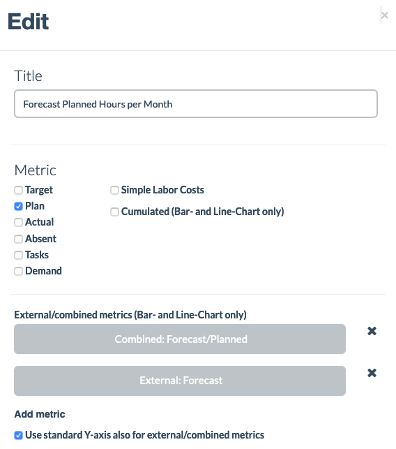
Example: Forecast/planned hours

-
Here, the value "Plan" is selected to evaluate planned hours.
-
Do not place the tick next to "Cumulated" since we do not want to see the cumulated value at the end of the month, that is at the far right-hand side of the diagram, but just the value/interval (here: planned hours/day).
EXAMPLE: If you have a value of 5 for each day, the cumulated value after 5 days will be 25, for non-cumulated the value 5 is displayed for each day -
Adding the external metric "Forecast" as a metric to also be able to display it individually in the diagram – this is not necessary, but improves the overview since the pure value per day is displayed here
-
Adding the combined metric "Forecast/planned hours" as a metric
-
Place the tick next to "Also use standard Y-axis for external/combined metrics" This makes the diagram easier to understand because the individual metrics only follow one Y-axis. (Feel free to try it out and see how differently it is depicted.)

-
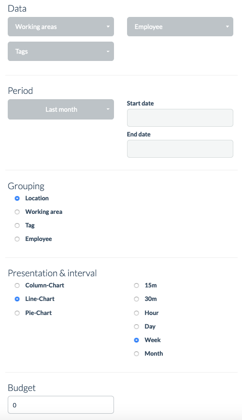
In this case, the metric is based on all working areas, all employees, and all tags; nothing needs to be set here.
-
The external metric was imported for the period 9/1/ – 9/30/, so also specify this period here.
-
Take the location as grouping since we imported the location-related forecast
-
A line chart as well as a bar chart can be used here
-
Since 30 days were imported, here you can select "Week" or "Day" to see comparable figures

Now click on the "Save" button and the report is all done!
By the way, you can also hide lines by clicking on individual words at the bottom of the report.
Are there any other questions? Feel free to get in touch with us!
The Support team